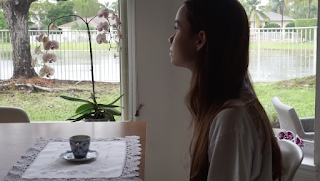
I will most likely alter the hues and exposure on these to match the way I will do the color grading. I want to bring out all the blue tones in the film. I'll discuss this more when I start editing color!!
Also, Yejin sent me their drafts today for the postcard and I fell in love jsdnvklj
This first one I thought was super creative and eye catching, and I love how each scale would be a different shot from the film. I thought it was really cool how the fish tail would be shown in the back.
And this!!!! I've decided this is the one. Yejin thought it was very dy humor, which is what I'm going for. You see this image and don't know if you should laugh a little or cry a little, which is what I'm going for in this film. There will be clouds around also.
To have consistent branding, I feel like I most likely will go with either of the fish stills. I feel like the teacup is bigger of a symbol in the film though, so I'll have to see. Maybe the stamp in the postcard I mentioned earlier could be a little teacup?
Also, I think I will be naming my film "Afloat". Almost sure, not 100% positive. But when I hear this word I think of the following:
- Fish
- Static
- Pondering
- Water
Which pretty much makes up my entire film. It's a good option I think. I'm really excited!! I'm happy everything came together, when it was once a little messy and uncertain. Being able to accomplish this project really gives me a sense of reassurance.


No comments:
Post a Comment